Overview of Project
Due to COVID-19, various health precautions need to be met when entering a facility. The most common is a temperature check, verifying people meet the minimum health guidelines. A local city government needed an application that would record their employees’ temperature and health symptoms in order to determine whether they can enter the premises. This application is intended to be used at 3 dozen facilities for over 3000 employees. Each facility's entry point will have at least 1 screener.
Problem
"How might we design an experience that can adapt to screening employees during high and low traffic hours?"
"How might we accelerate the employee identification process?"
"How might we account for employees that do not have their primary identification?"
"How might we determine if an employee meets the CDC’s minimum health guidelines?"
"How might we gather information and effectively test if no one is allowed at the premises?"
Solution
Design an application (for the tablet) what will accelerate the sign-in process. We're designing for the tablet because it has a large screen and is mobile. While collaborating with the client, testers, developer, and Project Manager, we were able to create a sustainable product through constant iterations and testing.
Client
A local city government
My Team
Project Manager, Software Developer, UX/UI Designer (me)
Design Tools
Research: Google and Zoom for testing
Ideation: Pen and paper
Wireframing and Prototyping: Figma
Visual Design: Adobe Illustrator and Google Material Design
Duration
4 weeks with ongoing support
—————————–
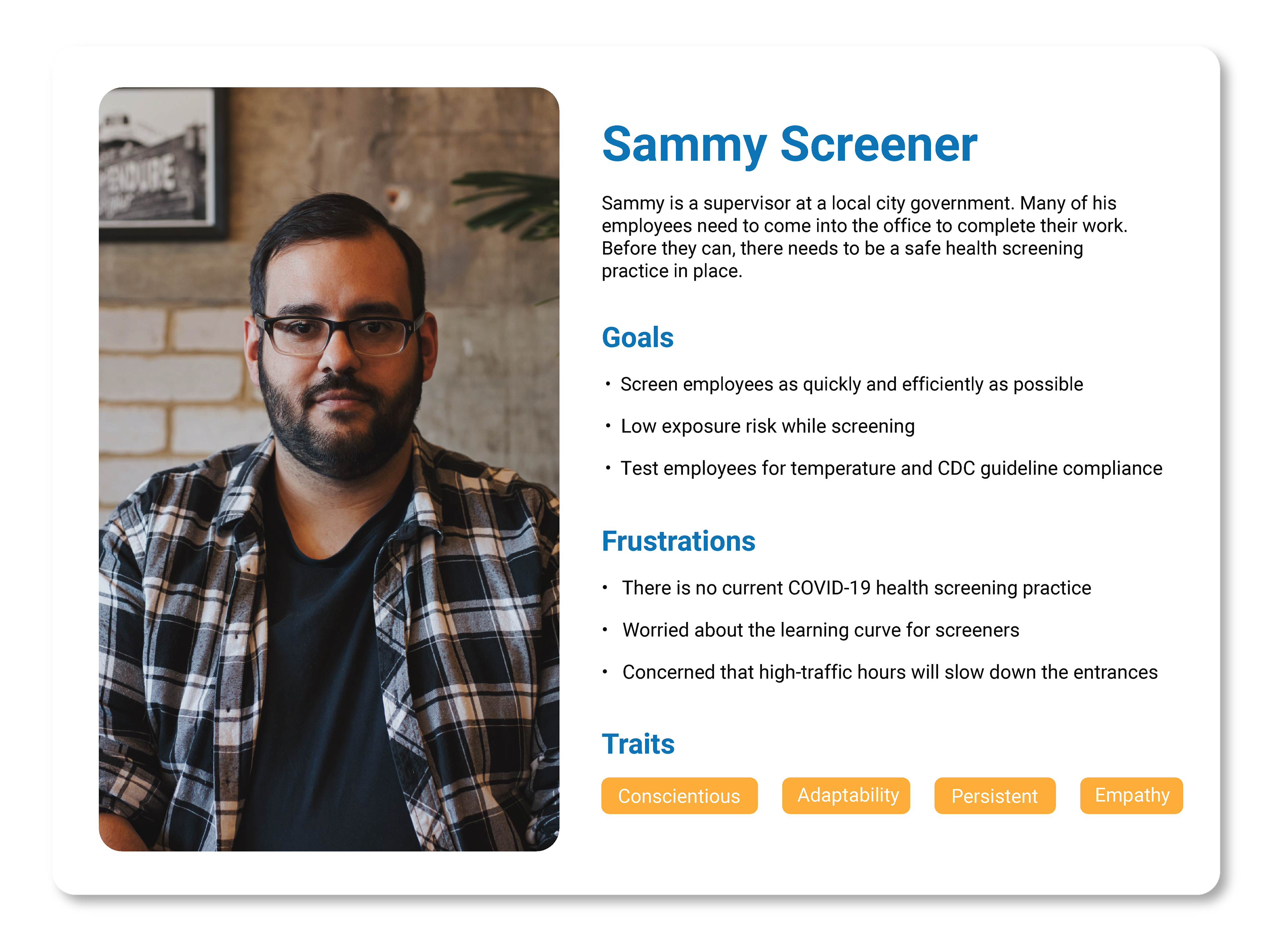
Persona
The clients goals were to roll-out an application that is easy to learn, offers low-risk to exposure, and quick to screen employees. Their main concern was holding the line during high-traffic hours because a large gathering would be violating CDC guidelines.
How Might We's
1. How might we design an experience that can adapt to screening employees during high and low traffic hours?
During the discovery phase, one of the client’s desires was to have the application adapt to the volume of employees entering the premises (high vs. low traffic), while also screening every entrant. We also want to prevent long lines and large groups in compliance to the CDC guidelines. The #1 priority is to be as safe as possible.
One of my first ideas was to have two versions of the application: one for high traffic and the other for low traffic. However, that did not seem practical because switching between applications will not only slow down the line, but also frustrate the employees.
The next idea was to have the ability to switch between the two screening modes within the application. This seamless idea provides a functional solution with very little screen navigation.
2. How might we accelerate the employee identification process?
The client informed me that each employee has an identification badge with a QR code on it. This is the fastest method for checking in each employee, so I determined that the application should have the ability to scan QR codes for validation against the back-end database.3. How might we account for employees that do not have their primary identification?
Since we are all human, we tend to forget our personal belongings, like our ID badges. Employees forgetting their primary identification was a recurring issue, so we needed to address this pain point within the application.
In this client’s case, each employee is issued an ID number and an email address upon onboarding, and every employee memorizes at least one of these attributes, hence in case of the badge being forgotten, the employee can provide either of these two pieces of information in order to be identified in the absence of the badge. This means that the application will require a lookup feature that can locate the employee using either their email address or the employee ID number.
4. How might we determine if an employee meets the CDC’s minimum health guidelines?
Each screener will ask the COVID-19 screening questions as well as take the non-touch temperature measurement on the forehead of the entrant in order to record it. There will need to be a field for the screener to input the temperature measurement.
5. How might we gather information and effectively test if no one is allowed at the premises?"
Since we cannot physically be at the site, we will utilize Zoom and other cloud-based services to communicate and test with the users.
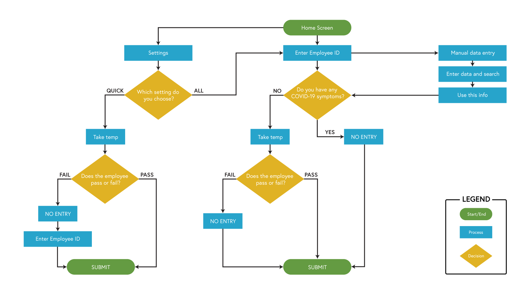
Process Flow Diagram
Now that I had an idea of the application’s potential features, I needed a better understanding of the process and different use cases. This was the perfect opportunity to create a flowchart.
Before doing so, I had to define the different steps:
1. Collecting employees’ identification
• QR code vs manual entry
2. Ask screening questions
3. Take temperature
4. Submit
The faster (QUICK) mode is to be used during rush hour when many employees are entering the building. The thorough (ALL) mode collects all information, starting with the employee ID.
During this process, I was able to collect the 5 W's:
Who: We are creating a solution for the COVID-19 screeners
What: The screeners will be using a health-screen application for tablet
Where: This application will be used at each entry point for over 3-dozen facilities
When: This application will be used during working hours
Why: If there is not an effective screening procedure in place, then the employees could not come into work
The client and I determined that the quick mode should only ask for an employee ID if they do not pass the temperature check. With the flowchart, I was able to communicate the process of how the client envisioned the application to perform. Once I received confirmation, the next step was to sketch my ideas.
—————————–
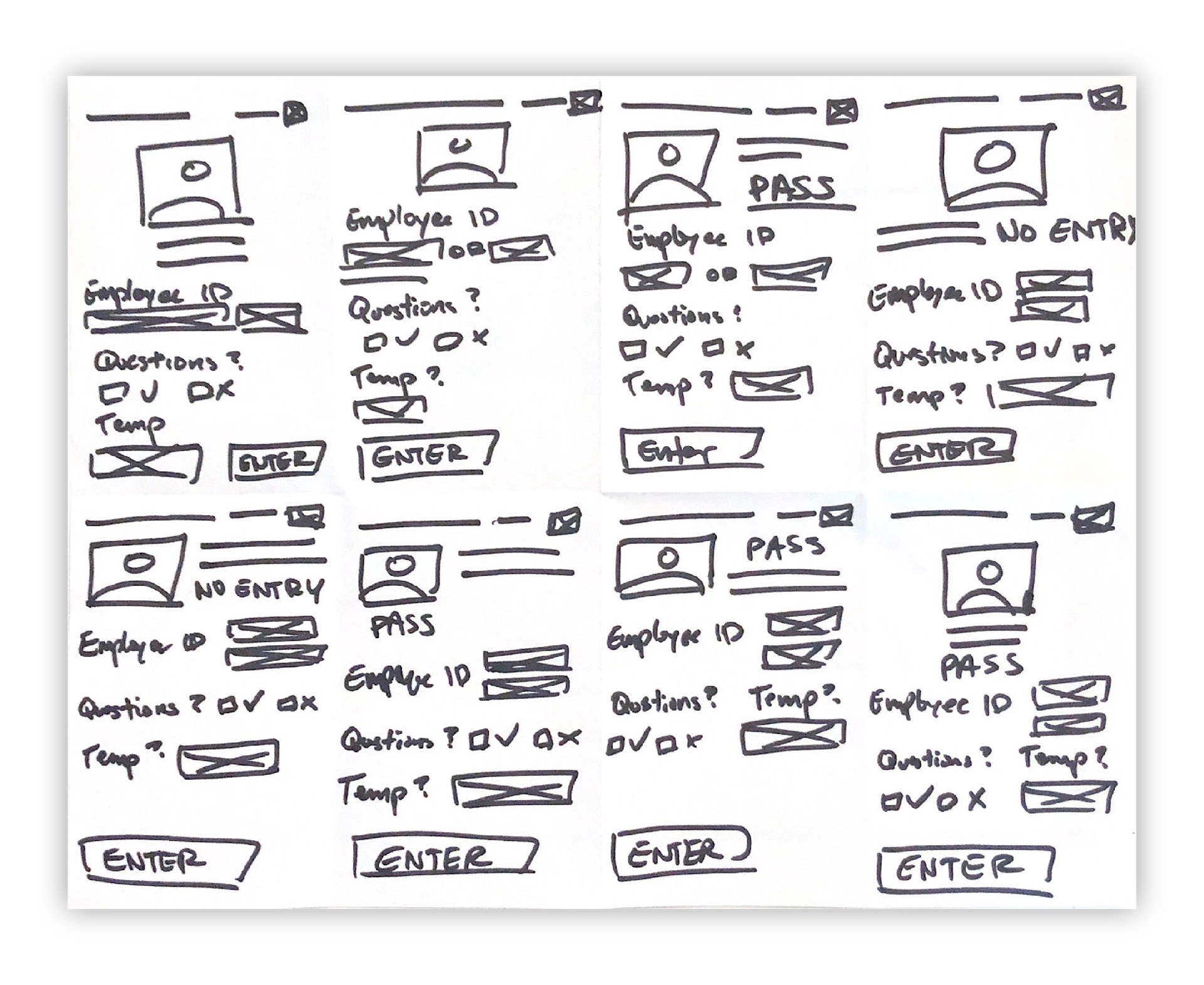
Crazy-8s
The reason this method is one of my favorite idea generators is because I am pushing beyond my first idea. I used to always fall in love with my initial ideas but this exercise has helped me improve.
Before starting, I identified 3 main screens for this application: the home page, the manual entry, and settings. I came to this conclusion because the rest of the pages will reflect the elements of these three.
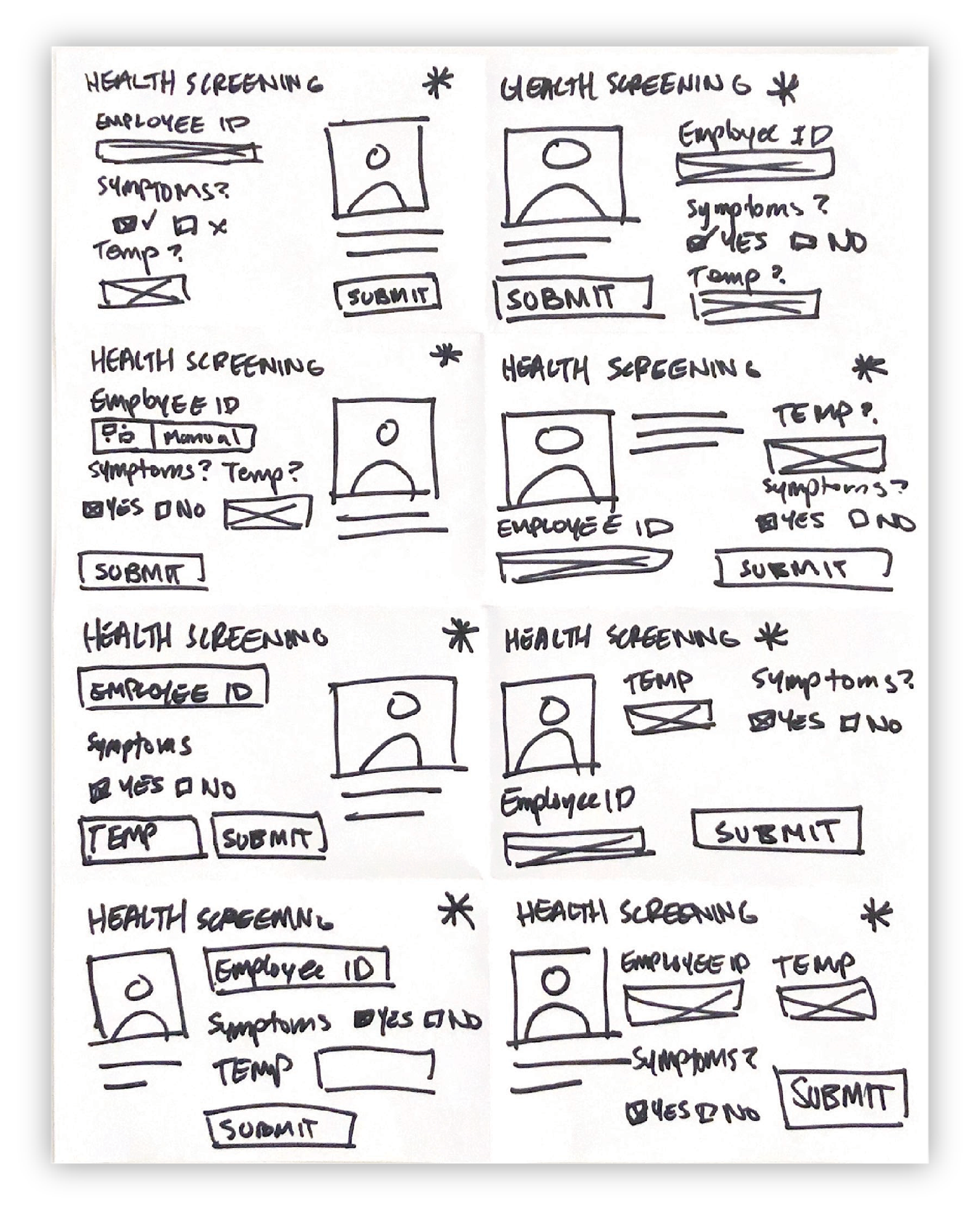
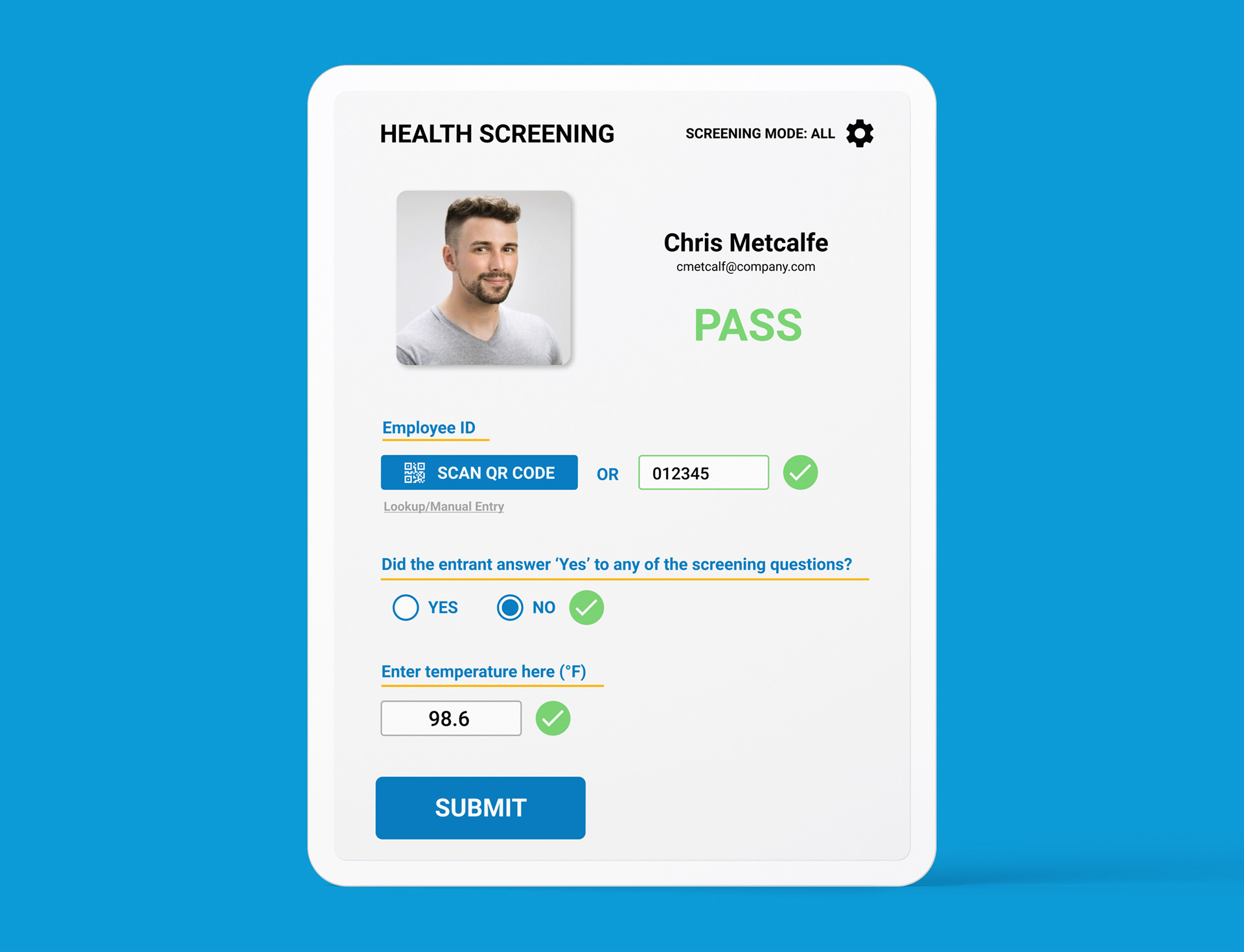
HOME SCREEN
Employee ID - Since the fastest sign-in method is to scan a QR code, I experimented with the button’s location. The Manual Entry option is beside the button because it is also a sign-in method. Once the employee is signed-in, the photograph of them will appear along with their first/last name and email address.
Do you have COVID-19 symptoms? - This screening question will contain a simple yes/no check field.
Temperature - This text field will require the screener to enter the temperature measurement.
Submit - This button will appear once all the fields are completed.
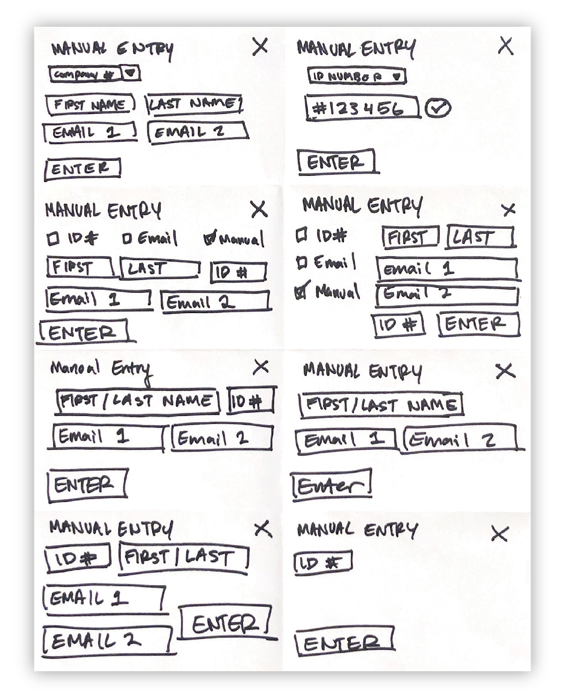
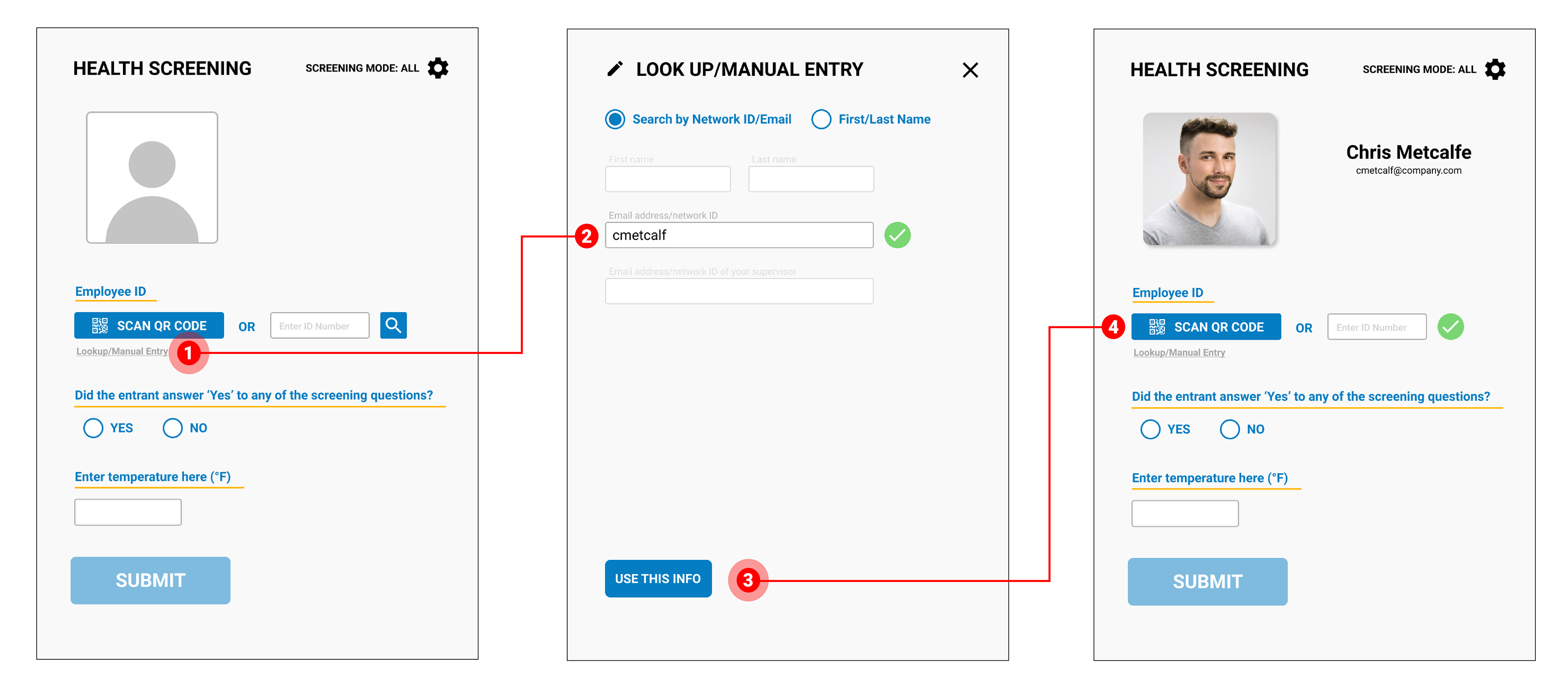
LOOKUP/MANUAL ENTRY
Three filter options seemed the best direction because there were different credentials an employee could give to the tester: Identification number, Email, Manual Entry (first/last name). For selecting the filter, I experimented with checkboxes and drop-down menus.
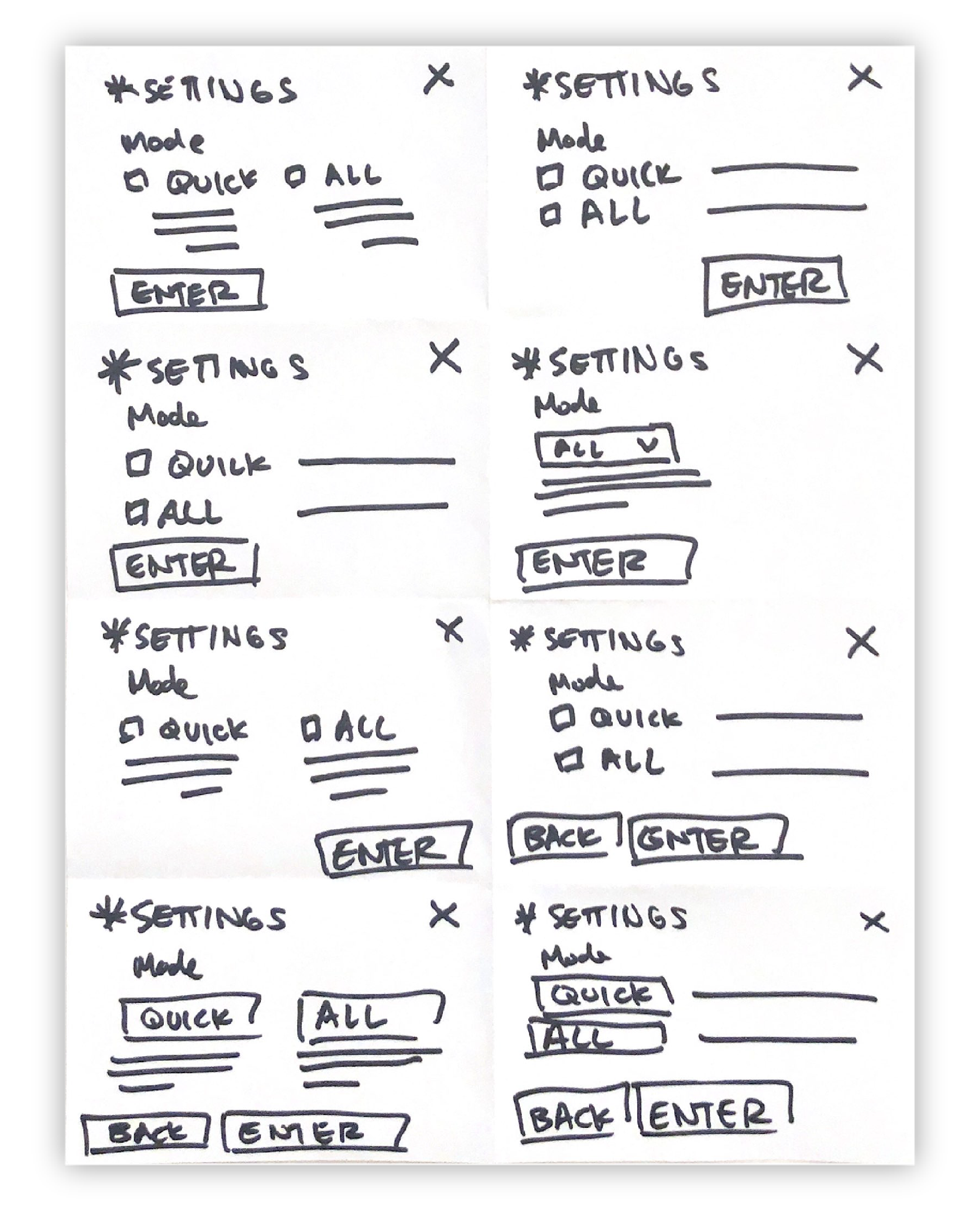
SETTINGS
The Settings page was the most difficult for me to generate ideas because of how little features needed to be displayed. I experimented with format to make the experience as efficient as possible.
—————————–
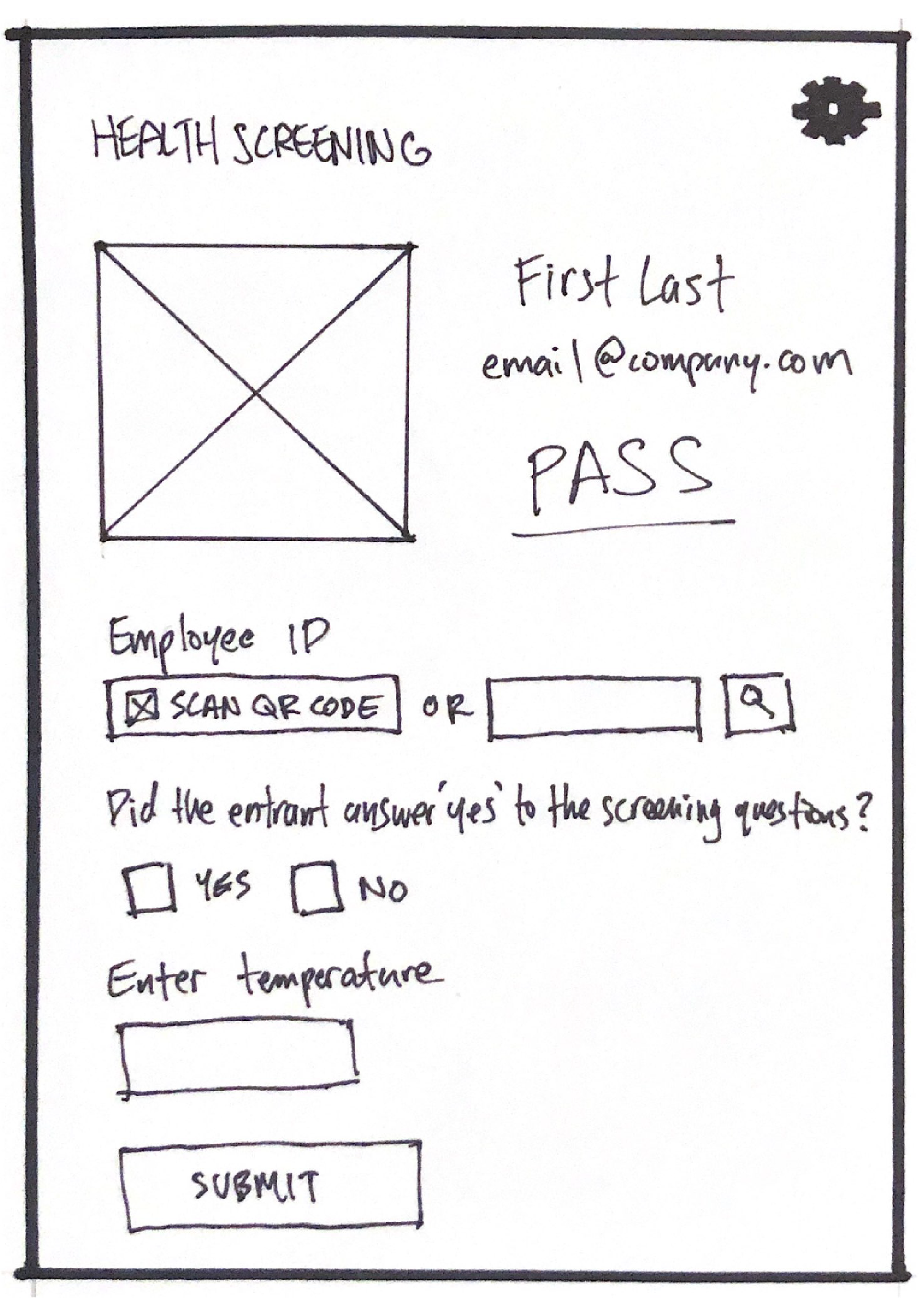
Final Sketches
After a lengthy discussion with the client, we decided on the format and text for the final sketches.
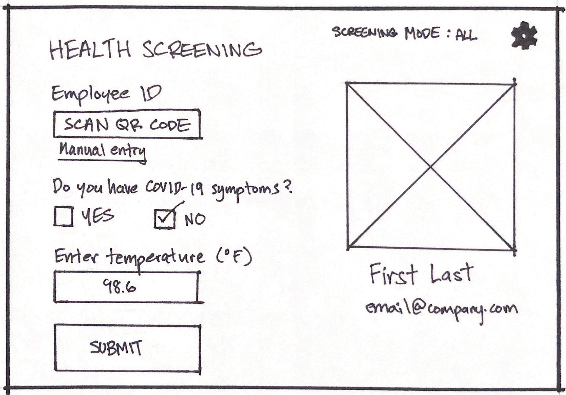
Home screen final sketch
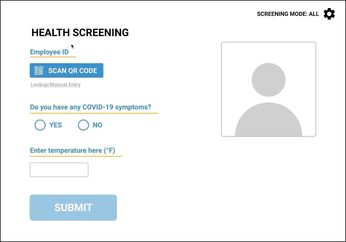
HOME SCREEN
Layout - We decided that the input fields should be on the left side and the employee info on the right. This provides an easy experience for the tester because the fields are going from top to bottom (1. Employee ID 2. Screening Question 3. Temperature 4. Submit).
Employee ID - The “Scan QR Code” button will be the immediate option because it is the most frequently used sign-in method. Manual Entry will also be there, however, it will not be as prominent.
Settings - To navigate to the Settings page, there will be a button on the top right.
Mode display - Beside the Settings button, there is also an indicator displaying the current mode the user is on.
Submit button - To prevent users from accidentally pressing “Submit”, it will be inactive (greyed out) until all of the fields are complete.
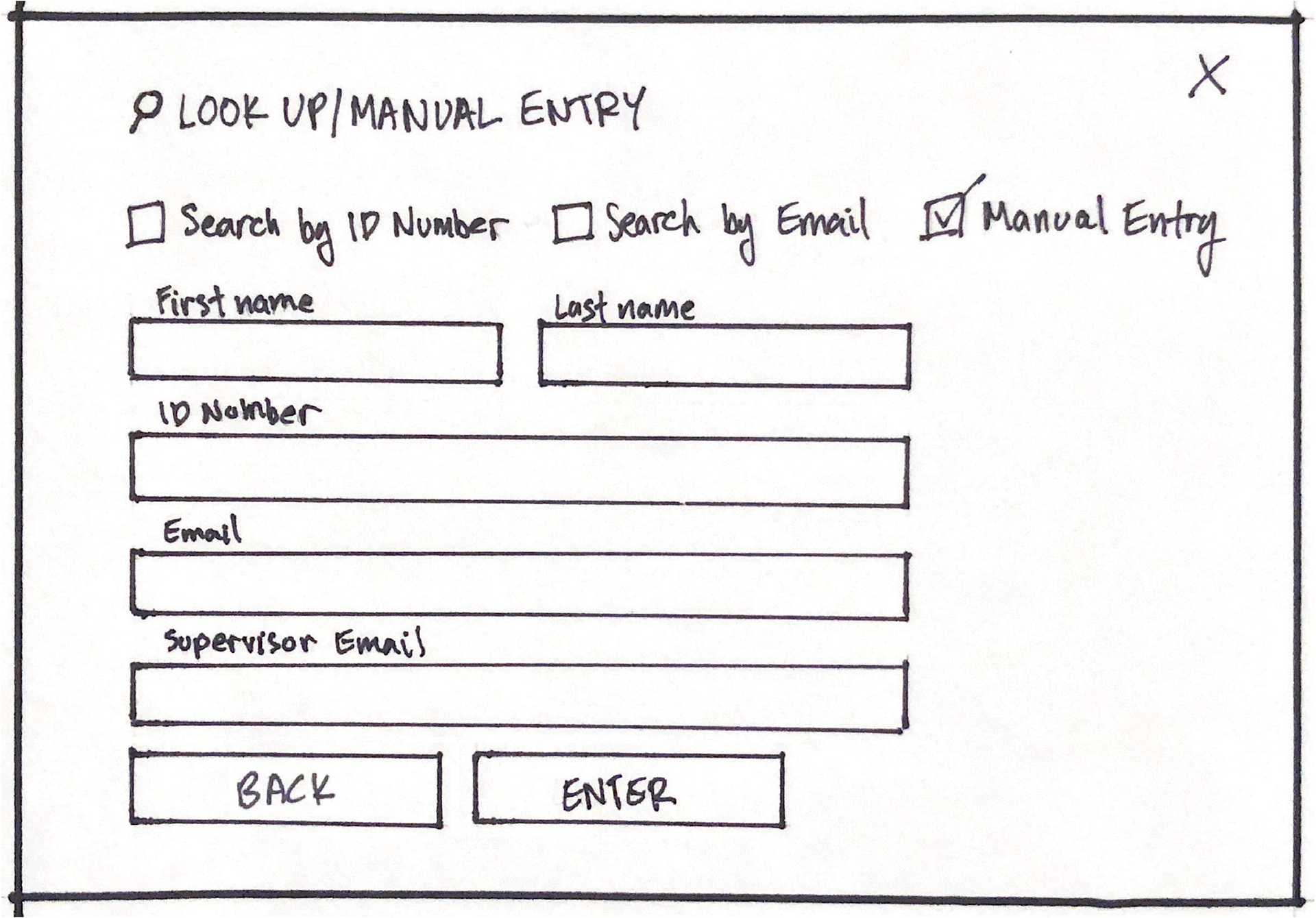
Lookup/Manual Entry final sketch
LOOKUP/MANUAL ENTRY
Filter - To limit the amount of clicks, we laid out the options from left to right. Initially, we wanted the dropdown menu, but it would not have been efficient given that this application needed to be used in a rushed environment.
Fields - All of the fields will be inactive (greyed out) except for the filtered field that is selected. Only one field will be active at a time, and the default filter will be “Search by ID Number” because it is the second most-common form of identification.
Exit - For the user to exit the screen, there is a Back button next to the Enter button and a Cancel button (X) on the top right.
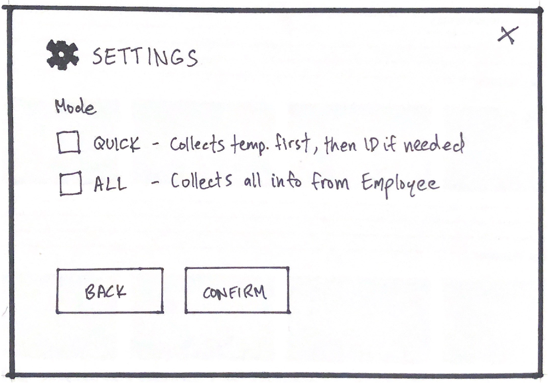
Settings final sketch
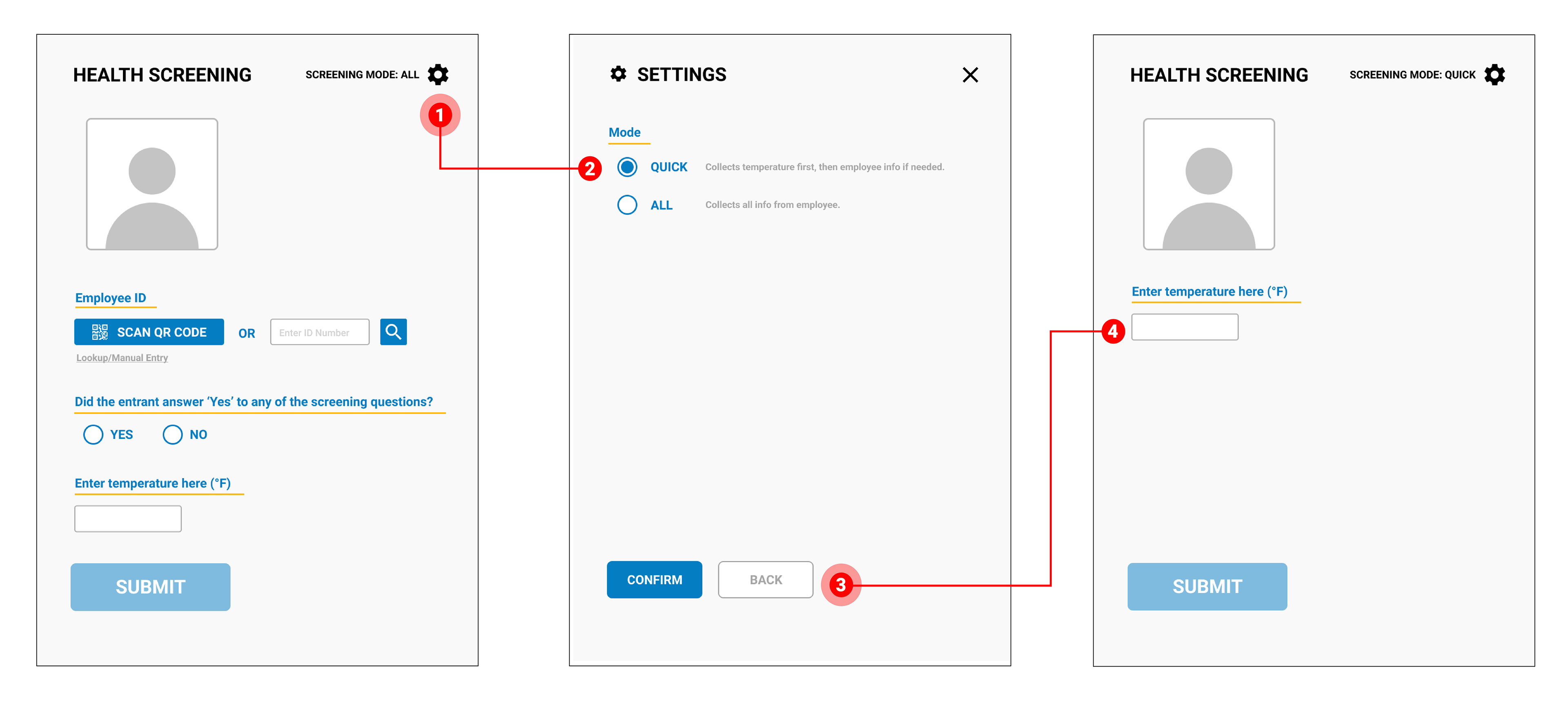
SETTINGS
The Settings page will be kept simple. Its purpose is to define and select the mode the user needs.
To exit the screen, there is a back button next to Confirm, as well as a cancel button at the top right (X). This layout is consistent with the Manual Entry page.
I was concerned that one yes/no field is too little for the entire Settings screen. Normally, there would be multiple settings to configure. I asked the client if this was a necessary screen. They told me that there would often be new screeners, so the explanations for each mode will be useful. They also ensured that there would not be sudden instances of going back and forth between modes. If there is a rush, the screener will have to switch the modes once. Once the rush is over and it is slow, they can switch back.
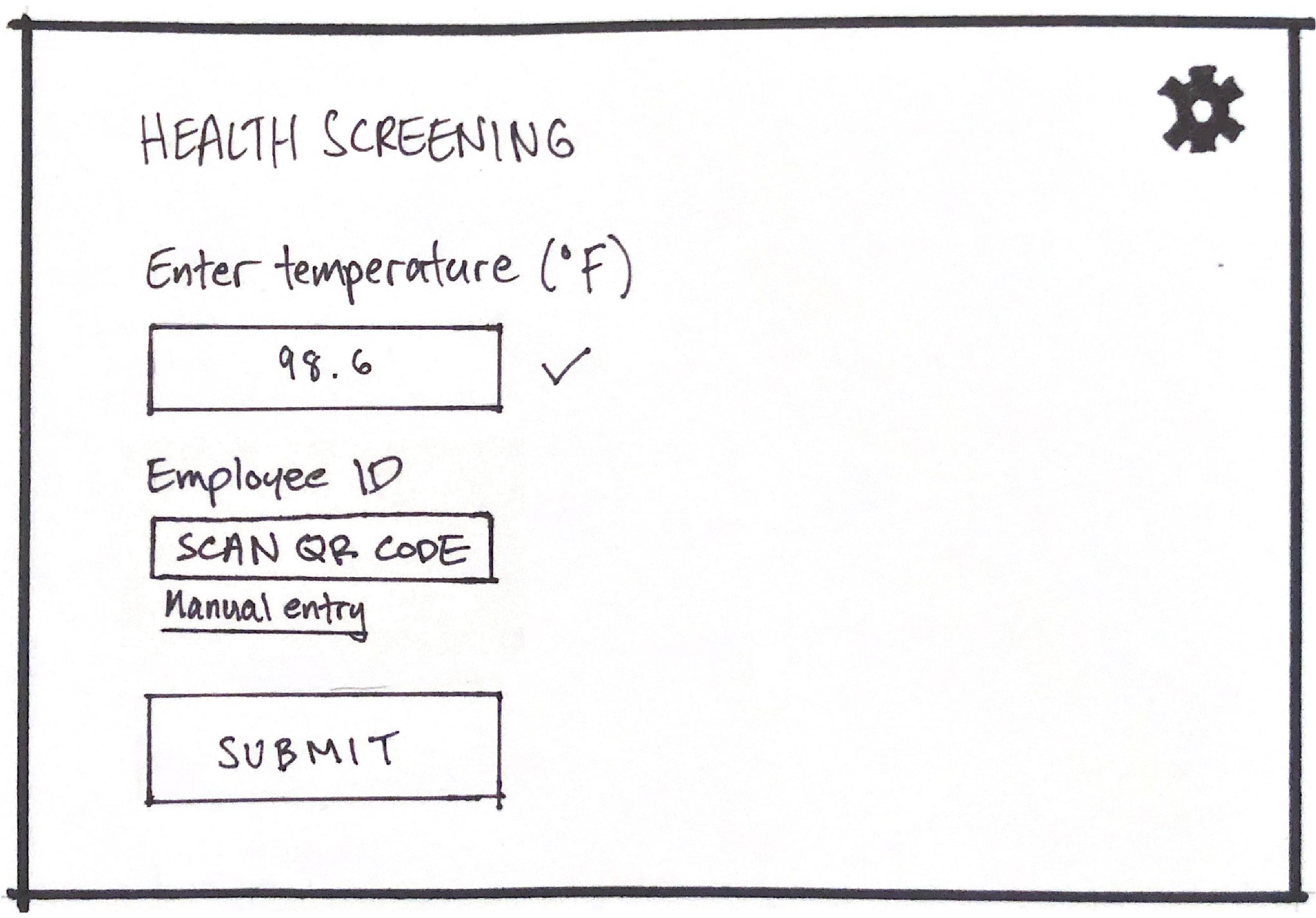
QUICK mode final sketch
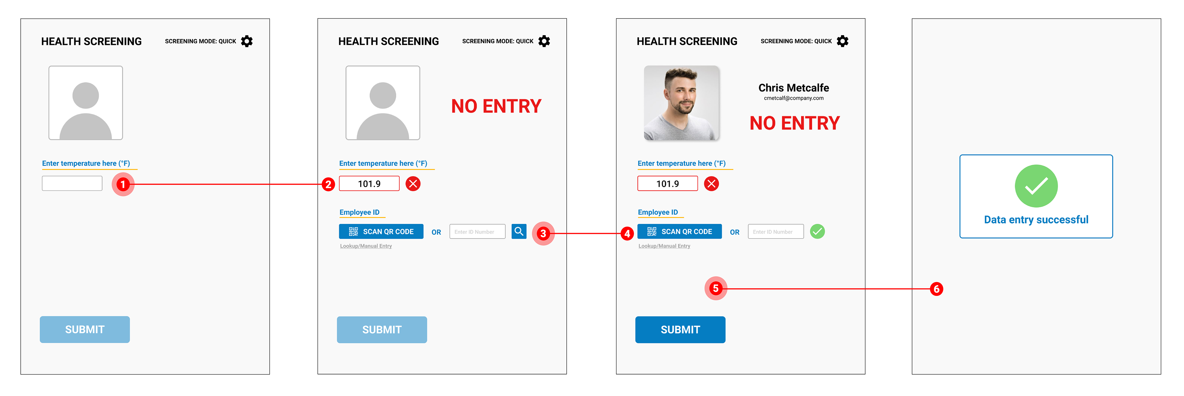
QUICK MODE
As per the requirements, the QUICK page will first collect the employee’s temperature. If they do not pass this test, they will need to provide their credentials.
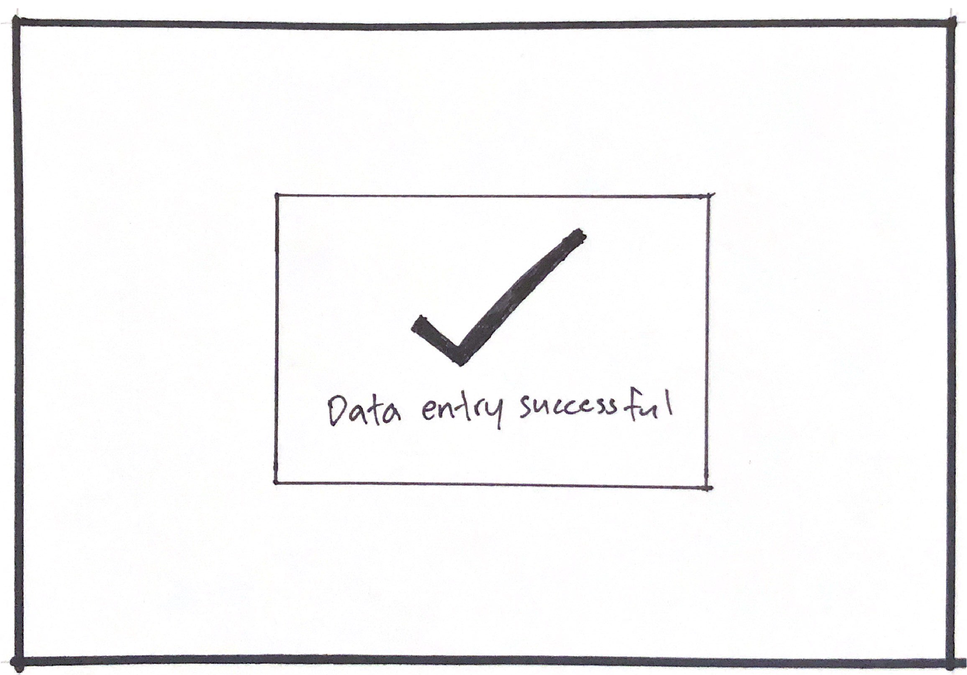
Data entry successful final sketch
DATA ENTRY SUCCESSFUL
This is the confirmation screen stating that the data is successfully collected.
Following several rounds of feedback from the client, a set of wireframes were created.
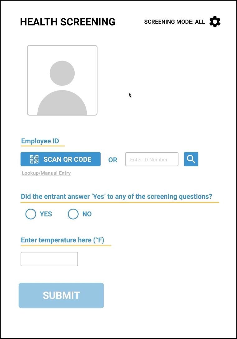
Wireframes/User Flow
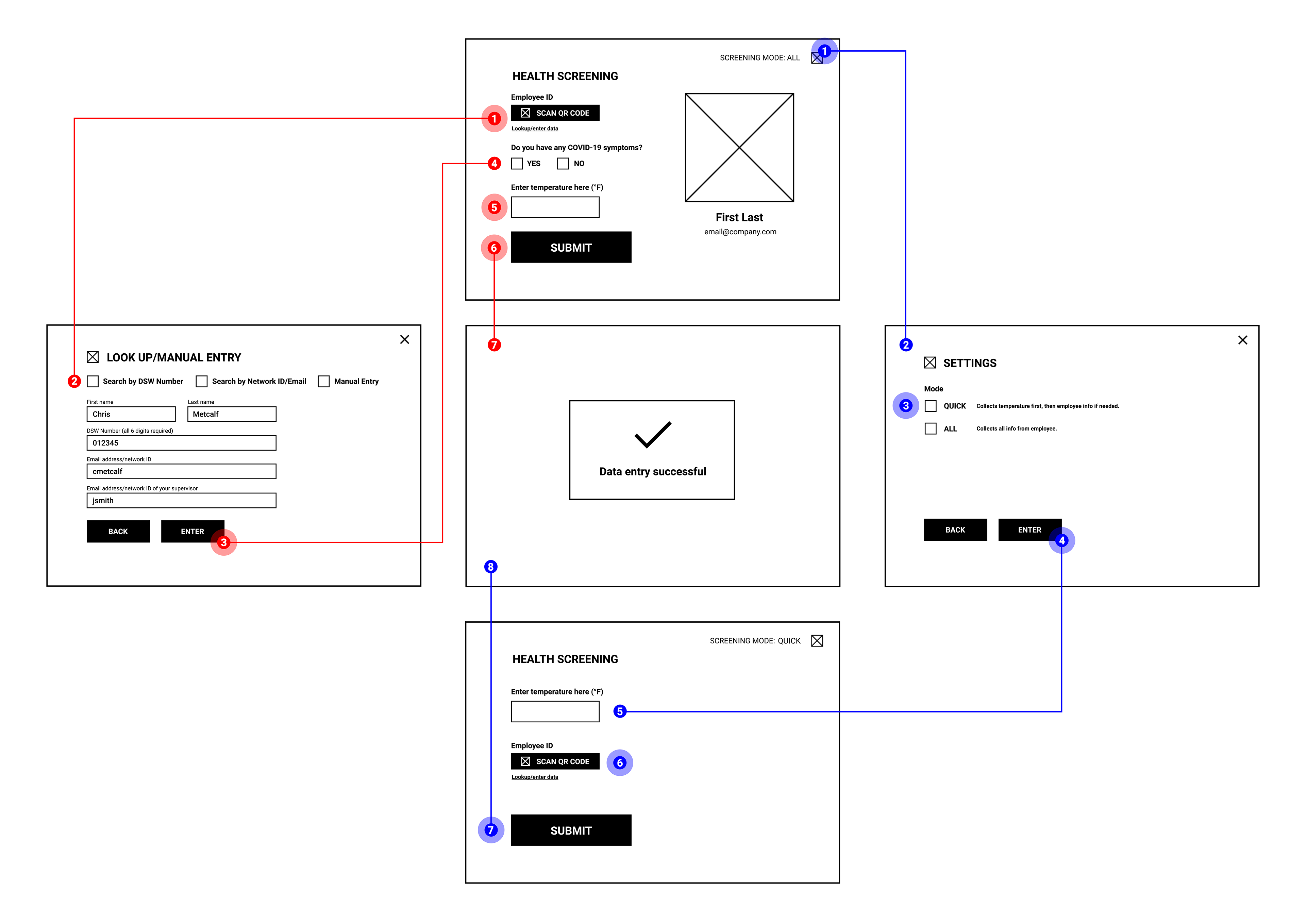
Wireframe and flow of the application
ALL Flow
1. Tester scans the employee’s QR code
2. If the employee does not have their badge, Manual Entry is used
3. Once complete, they press enter to return back to the main screen
4. Tester asks if the employee has any COVID-19 symptoms
5. Tester takes temperature
6. The form is submitted, whether the employee passed or failed
If the employee:
Passed - No action is taken
Failed - Employee is recorded into a NO ENTRY list and asked to leave
QUICK Flow
1. Tester presses gear
2. The tester navigates to Settings
3. QUICK mode is selected
4. Pressing enter goes to the QUICK mode screen
5. Tester takes temperature
6. If the employee DOES NOT pass, the tester asks for their credentials
7. The form is submitted, whether the employee passed or failed
If the employee:
Passed - No action is taken
Failed - Employee is recorded into a NO ENTRY list and asked to leave
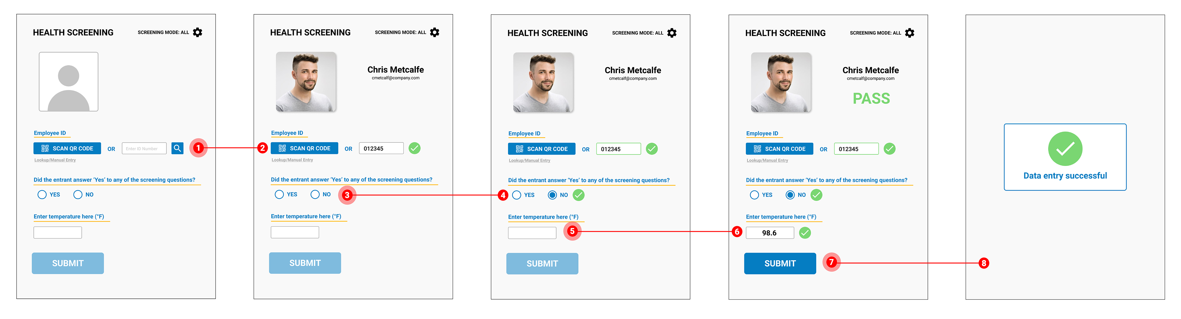
High-fidelity Prototype (Version 1)
Full walkthrough of application (The "PASS" and "NO ENTRY" buttons are supposed to simulate whether the screener entered a passing or failing temperature. They are not actually in the application)
Testing
Since this project took place at the beginning of the shelter-in-place order, I was unable to visit the site. This made testing a challenge because normally, I would visit the site to have accurate results. However, we decided to test remotely with the screeners through Zoom and cloud-based services.
Since the prototype was built using Figma, we linked each screener's tablet so they could open the application to test. We ran many different scenarios and instances that could potentially slow the line down.
We tested:
• The users navigation speed between screens (after giving them a few minutes with the application)
• Different use-cases:
- QUICK mode where the employee DOES NOT have their badge on hand and forgot their ID number
- ALL mode where the employee DOES NOT have COVID-19 symptoms but FAILS the temperature check
Although remote testing was very new to me, I appreciated the convenience a lot.
User-feedback and Refinements
After conducting a usability test with the users, they provided invaluable feedback:
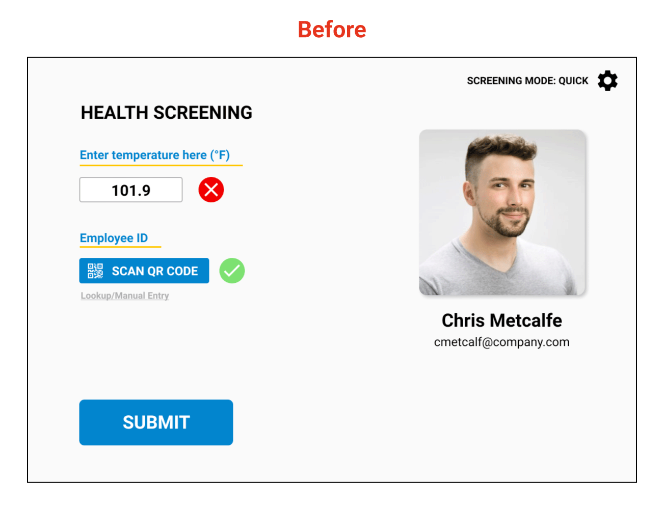
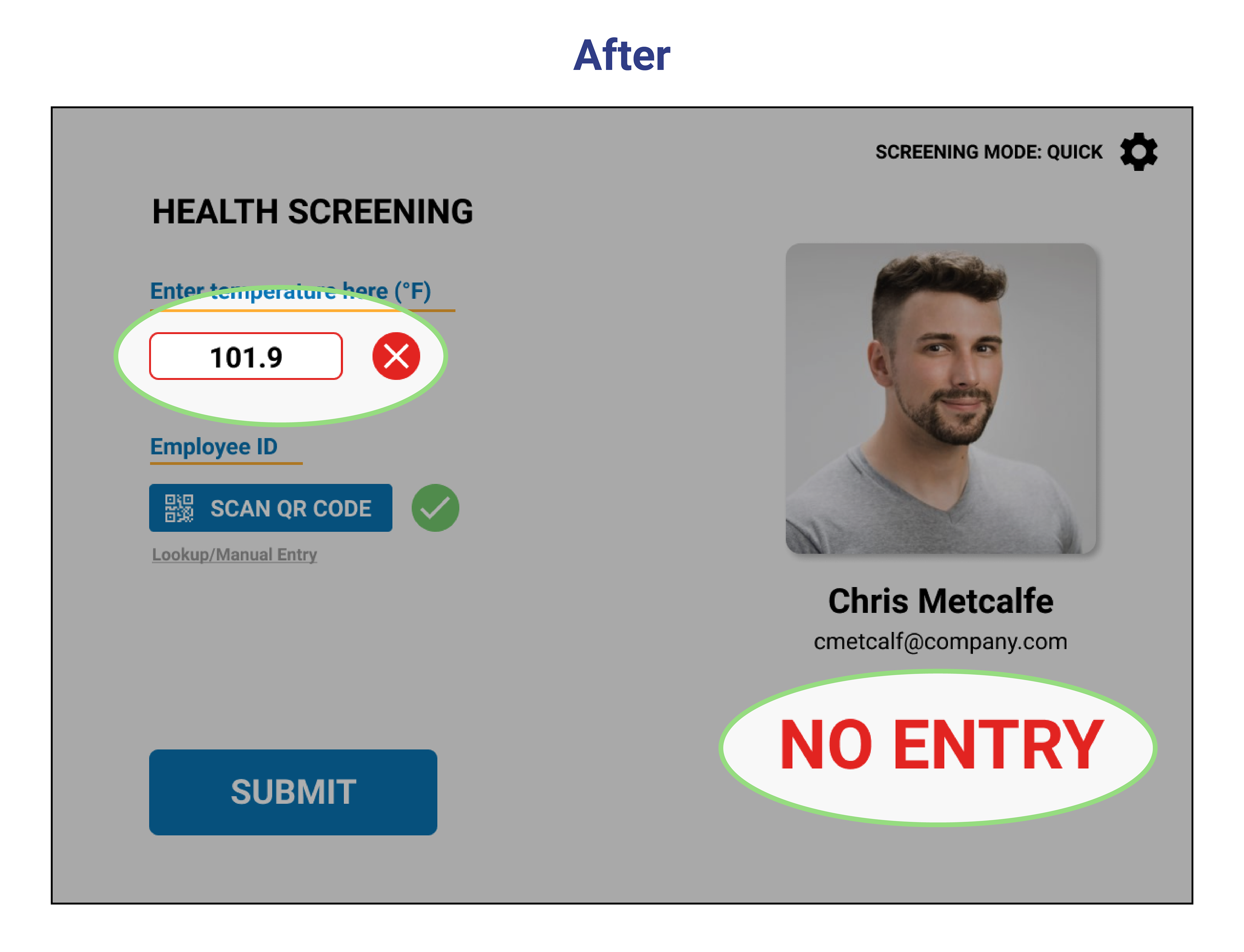
Feedback 1 - The PASS/FAIL result should be more apparent. The X and the ✓ are not clear enough.
Solution 1 - The outline of the temperature text box will change according to the result: green (pass) or red (no entry). Also, a highly visible text indicator (PASS or NO ENTRY) will appear on the right side of the screen.
They were 100% correct. The screener had to know if the employee passed or failed. The X or ✓ mark next to the temperature field was not enough.
After careful discussion, we added visual elements that would indicate the test result.
Feedback 2 - Testing the different use-cases helped them mentally prepare for unusual scenarios.
Development
Once I received confirmation from the users, I delivered the prototype and assets to our developer. The application is being built on Microsoft Power Apps, a tool selected by the client for its rapid delivery capabilities and its ability to run on company-issued Android and iOS devices.
Over the next two weeks, we met on a regular cadence to see how the application progressed. We were able to achieve a finished application that was ready for production in record time following the onset of the COVID-19 epidemic in the U.S.
Refinements and Support
Shortly after launch, I revisited the users to provide support and gather feedback.
Feedback 1 - They communicated that the manual entry screen was barely used. If that screen was needed, they would only need the employee ID number field because everyone knew their number.
This meant that going to the Manual Entry screen only for the ID number field slowed the screeners.
Solution 1 - Place the ID number entry field on the home screen so there would be one less tap for the screeners.
Feedback 2 - "The screener's finger would typically cover the camera, which is needed for scanning the QR codes. This is making the app a little awkward to use."
Solution 2 - Change the default orientation from landscape to portrait.
Feedback 3 - "Since there is more than one screening question, can we have the yes/no question entail all screening questions?"
Solution 3 - Change the wording of the question to "Did the entrant answer ‘Yes’ to any of the screening questions?"
Crazy 8s/Sketching (Part 2)
Since changing the orientation is more than just rearranging the content, I went back to the drawing board to solidify the new layout for the home screen.
High-fidelity Prototype (Updated)
Full walkthrough demonstrating ALL and QUICK modes, settings, and manual entry.
"ALL" Flow
"QUICK" Flow
Settings Flow
For the Settings screen, we redesigned the buttons because there wasn't a clear distinction between them. The confirm button is now more prominent so users do not accidentally press back after selecting a mode.
Manual Lookup Flow
Key Takeaways
1. I needed to empathize rather than sympathize
When we were testing the application with the users, I had thought that I covered everything they would need. I was proven wrong when they gave me their feedback. Simulating test cases and putting myself in their shoes was very challenging during this project because I could not be there. However, I learned how to conduct a remote usability test session during the process.
2. No matter how you test, it cannot compare to real-world scenarios
Remote testing was new to me. I thought I could account for all the possible pain points while testing, but there are always improvements to be made. I knew adjustments were imminent, so I am glad I was prepared.
3. The flowchart is a source of truth
Creating a flowchart gave me a better understanding of how to structure a solution. I constantly referred to this throughout the project and it helped remind me what I needed, why, and where it belonged in the process.
Impact
I revisited the client 6 months after going live and discovered that 1 in 375 screened employees were denied access to the facilities. Thanks to this application, we were able to screen and deny access to a handful of people with potential COVID-19 symptoms.
We were able to achieve our goal by providing a safer work environment for the local city government.