Unity Typeface
Unity is a typeface I created to reflect a futuristic look with clean edges to make it easy to read. During the process of creating the font, I wanted to make sure it was legible, bold and easy on the eye. As I was going through different shapes of each of the letters, I decided to keep each of the letters in a block shape so they would stay uniform. I went through many iterations on several of the letters so none of them would feel out of place. This font is intended to be used in titles when paired with graphics with futuristic and modern themes.
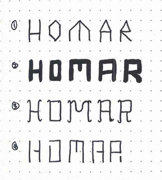
Sketches
The first step we took was to sketch out different concepts for fonts. As I was sketching, I settled on a san serif typeface since it's modern. I created only capital letters because they work better for posters.
Visualization
Once I completed my sketches, I began iterating using Fontstruct, a typeface creation program.
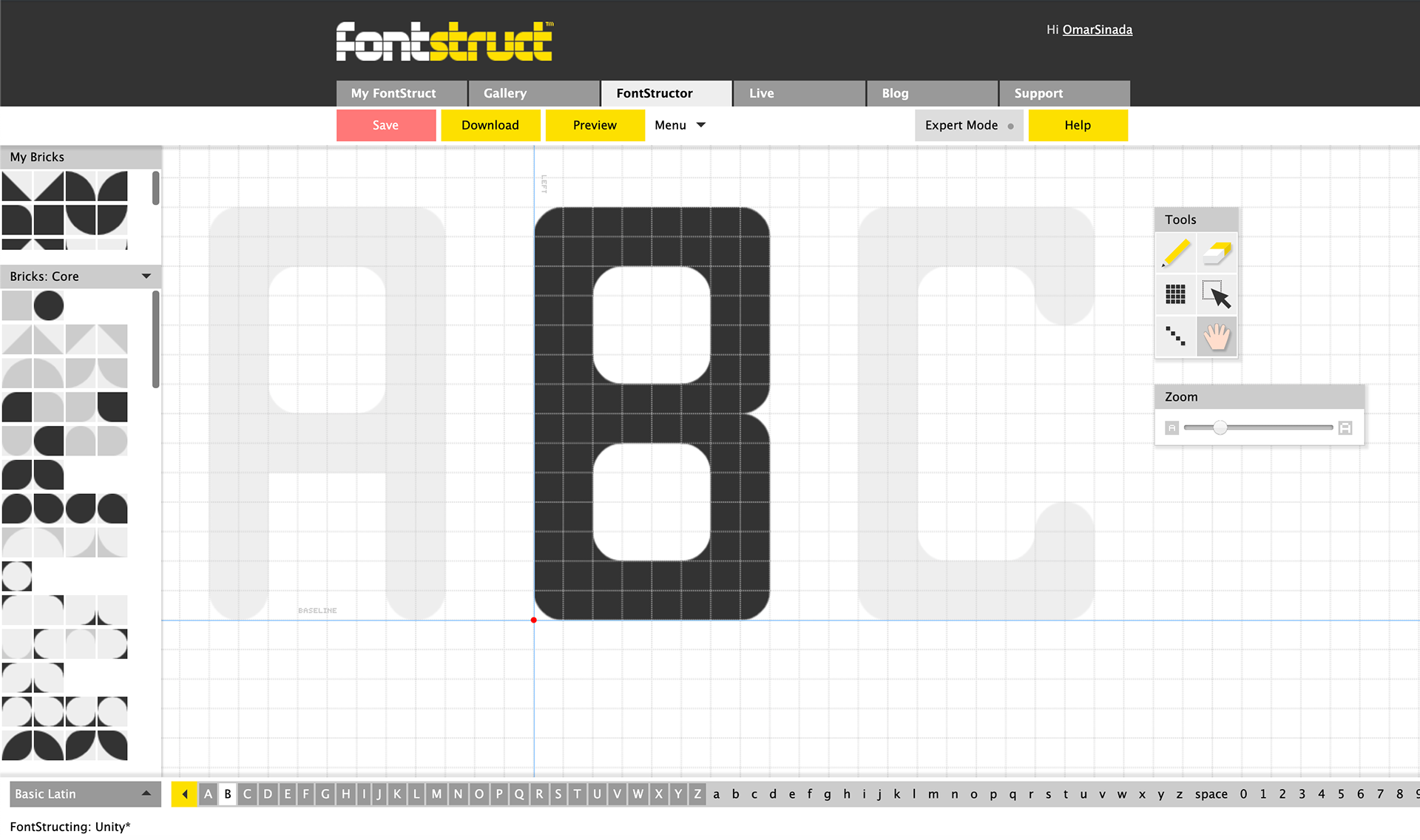
Creating Unity on Fontstruct
Process
When creating the fonts on Fontstruct, I only created the letters H, O, M, A and R - because those letters contain the basic alphabet forms for capital letters. Once I created those letters for each font, I asked my colleagues to vote on the font they thought I should fully complete.
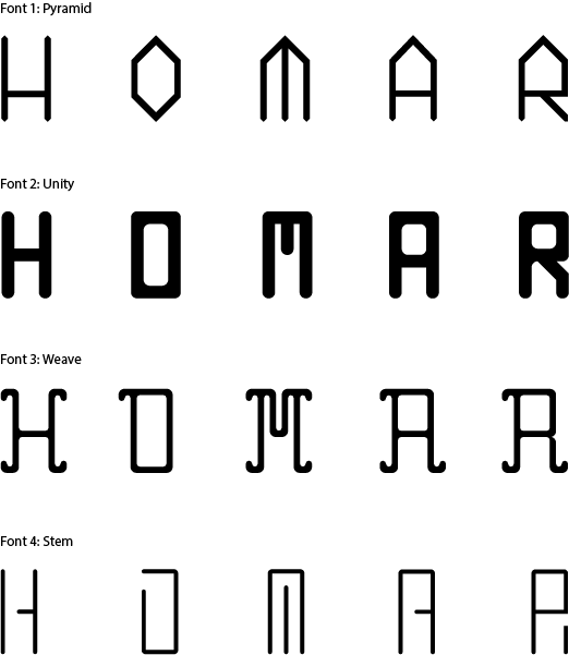
Designing the basic forms for capital letters.
Validation
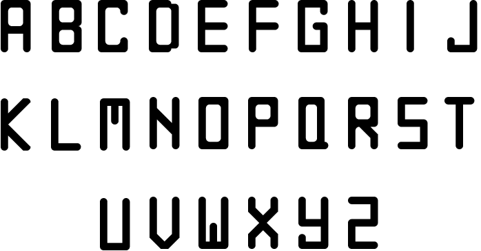
Once my colleagues voted on Unity, I proceeded to design the rest of the letterforms for the alphabet. I
revised and refined my typeface so it was consistent - so that all letters feel like they are a part of the
same family. I tested the letters in word combinations periodically to expose flaws and inconsistencies.
revised and refined my typeface so it was consistent - so that all letters feel like they are a part of the
same family. I tested the letters in word combinations periodically to expose flaws and inconsistencies.
Unity alphabet
Iterations
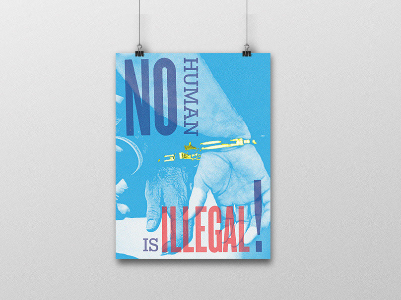
Once I completed my typeface, I moved to the next step of creating a grayscale poster utilizing it. Since
Saul Bass is a graphic designer whom I admire a lot, I used his quote "Design is thinking made visual" - a phrase that perfectly sums up my belief of what design is. I created 10 iterations of the poster while adjusting the type. A challenge I had was complimenting the typeface to the quote and vice versa.
Saul Bass is a graphic designer whom I admire a lot, I used his quote "Design is thinking made visual" - a phrase that perfectly sums up my belief of what design is. I created 10 iterations of the poster while adjusting the type. A challenge I had was complimenting the typeface to the quote and vice versa.
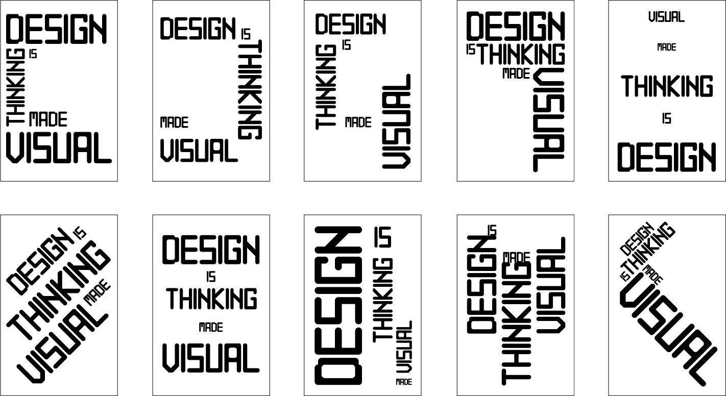
Poster iterations
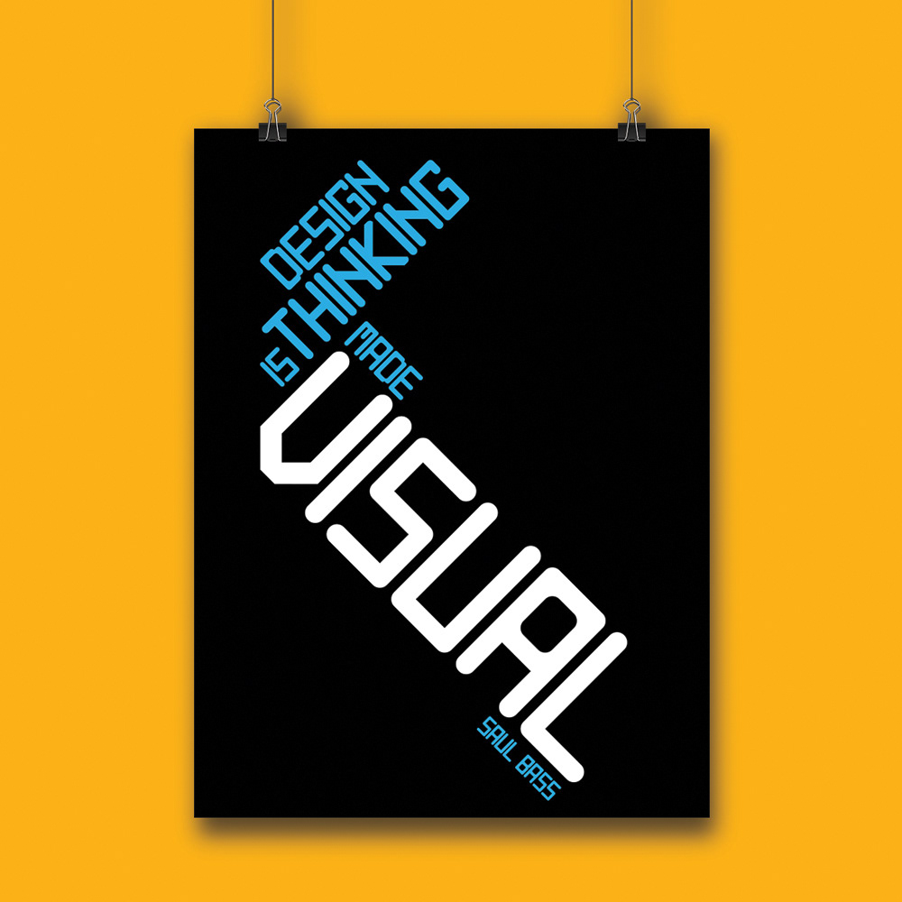
Color
The last step was to add color. The reason I chose the word "visual" as a different color and size from the rest of the text was to make it the focal point of the poster.
Unity typeface in color.